


Amazon Wakescreen Ad
Ui/Ux, Motion
The scent of a woman is a projection of herself. Potentially a lifelong consumer of the product, the modern woman simplifies her purchases through either traditional retail establishments or internet retailers. This Amazon Kindle Wakescreen ad seeks to facilitate that process through ease of use and captivating visuals. Amazon’s branding guidelines are efficiently executed while still exhibiting Chanel’s culture of luxury coupled with a user friendly method of navigation.
Role: UXD, Motion, Art Direction
Designers: Erin Oostra, Haley Blavka
Timeframe: 2 Weeks
Assignment: Amazon Kindle Design

Challenge
Chanel has been selling its products on Amazon for some time now but never has it sold its premiere perfume, Chanel No5. Until now No5 has been an exclusive scent sold only at specialty retailer's such as Nordstrom, The Chanel Store, and other specailty boutiques. The problem here was trying to combine Amazon's user friendly experience with Chanel's high end boutique style.
Solution
The goal for this animated wake screen was to draw the user into the product, intrigue them with different samples, then lead them to the website so they can easily buy the product. Using a hand drawn effect in the tagline we made the high end Chanel No5 perfume more approachable by everyday kindle users. Bringing in the great photography from Haley Blavka keeps the high end luxury aesthetic of Chanel No5.
Process
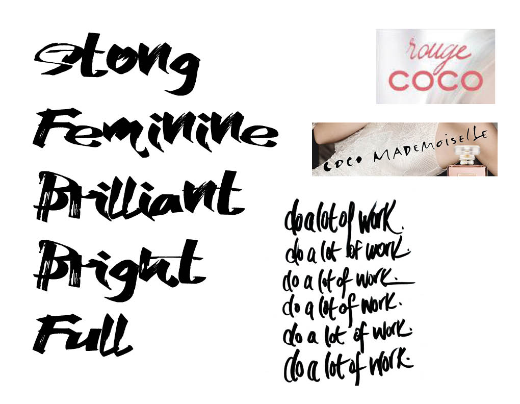
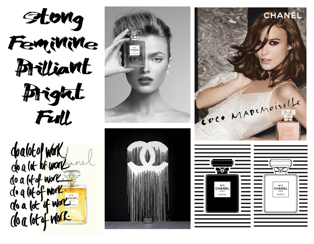
Erin and I began our project by looking deeply into Chanel's branding for No5. The perfume itself has a rooted history and has been their number one selling fragrance for over 100 years. Originating in French boutique storefronts and making its way over to America from young military men wanting to purchase the perfume for loved ones back home, the perfume made a huge splash on the western markets. Today's Chanel N05 takes on a rugged feministic persona, empowering women all over the world to be strong and independent.
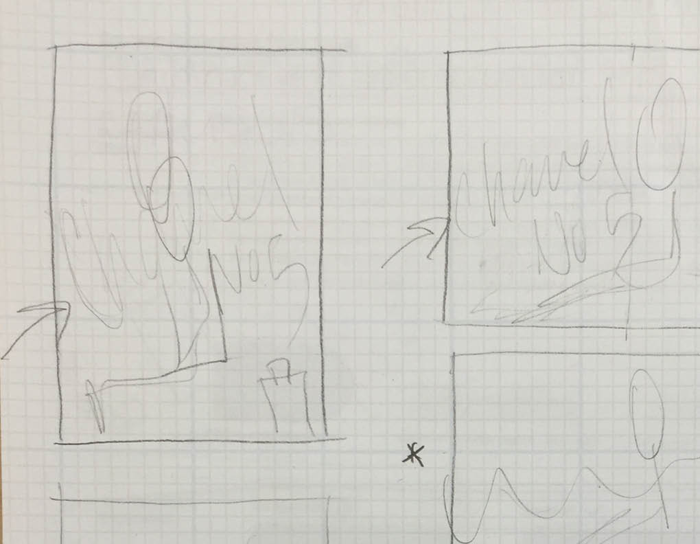
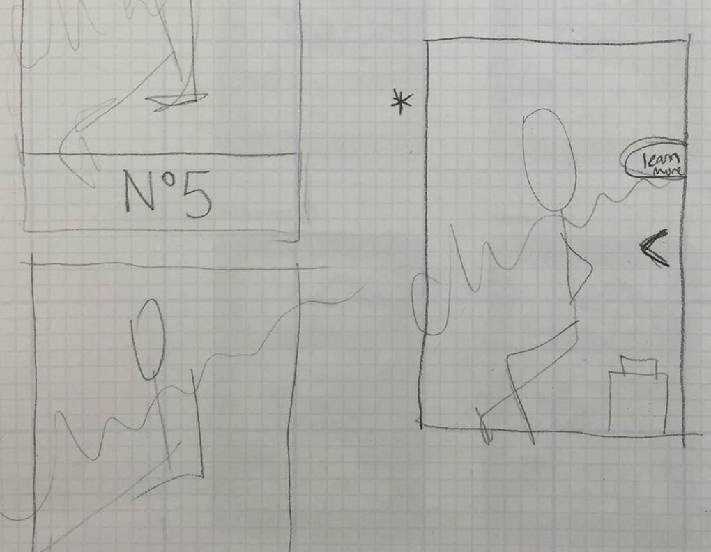
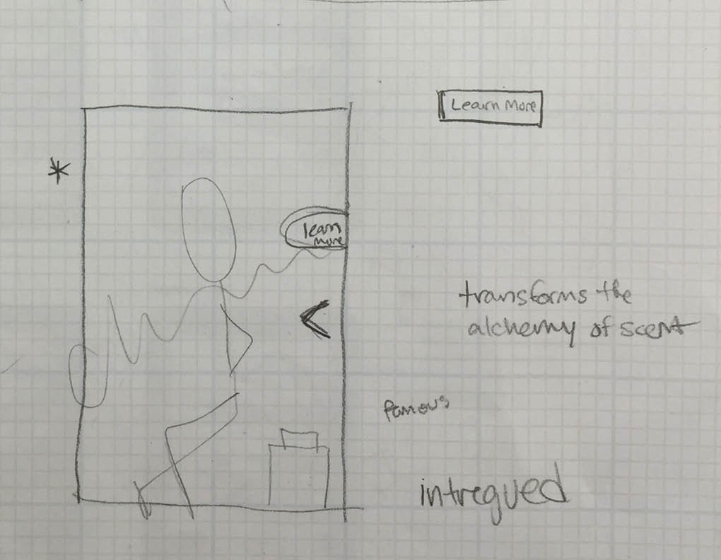
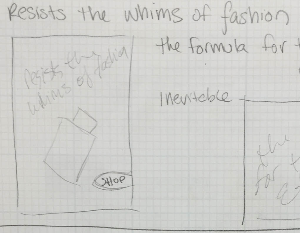
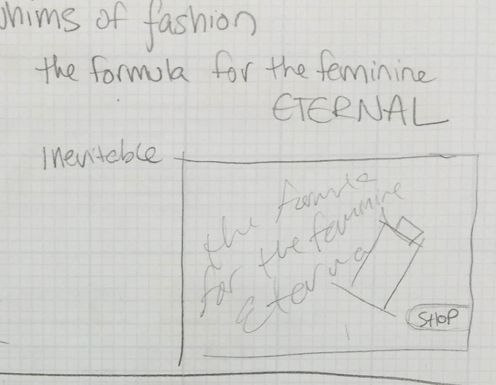
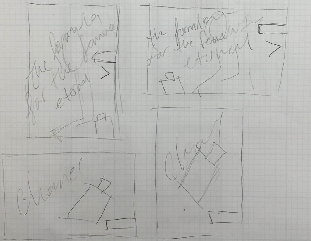
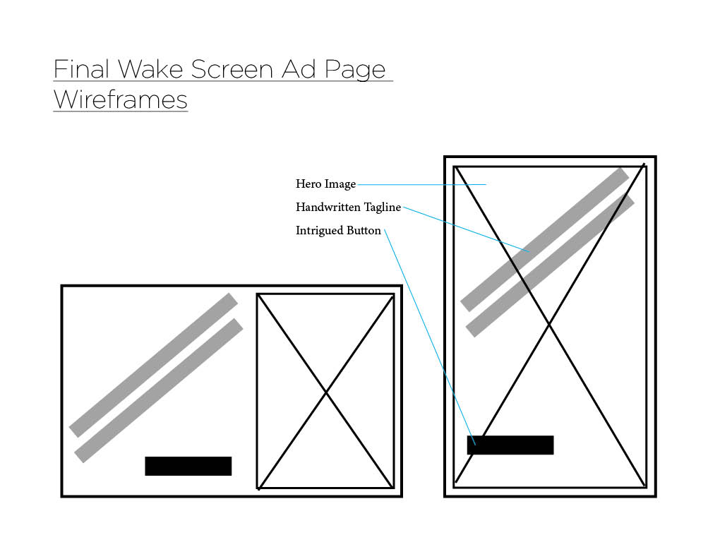
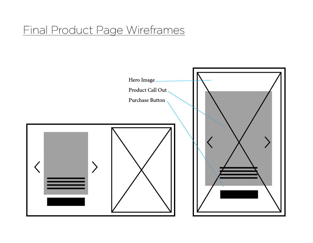
Wireframes
We worked through several wireframes, came up with a few captions in our research, and eventually landed on what you will see in the following videos. Through user testing and online research we found a black and white typpography scheme to be the best route, paired with an open design leaving room for the eyes to be led toward the product and move the user through out the design. We found what inspired us most was this Chanel No.5 featured site and their “For the First Time” video. We found out a lot about the history of the product, which led to our final caption: The formula for the feminine eternal.