


Alaska Airlines recently had its most significant rebranding in the history of its existence. As a visual designer, I supported multiple teams through the process of taking on a new identity while still keeping the website user friendly and accessible. I routinely took part in content strategies, UserTesting.com studies and A/B Tests to further validate our design choices. Working across multiple channels helped to ensure a cohesive experience whether you're on the website, the mobile app, walking through the airport or looking at social media.
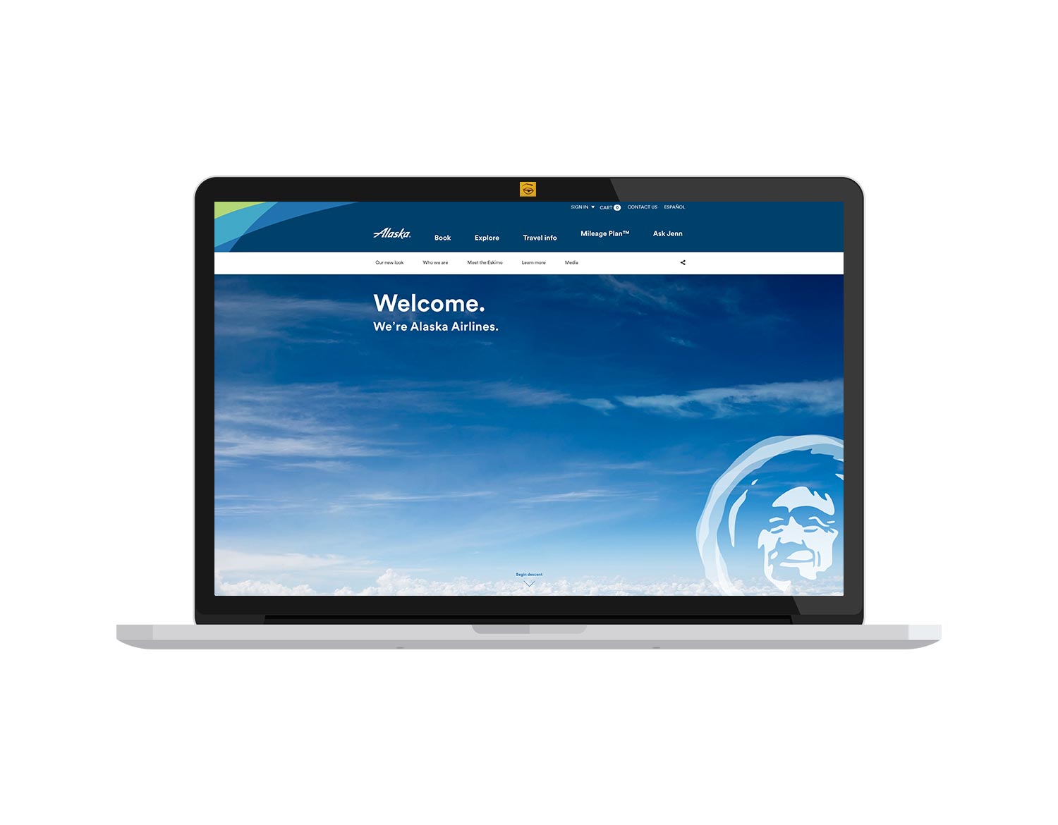
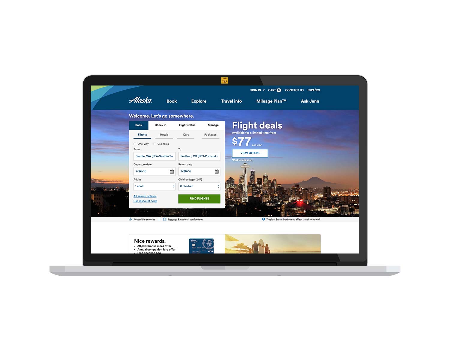
Alaska Airlines E-commerce Website
visit site
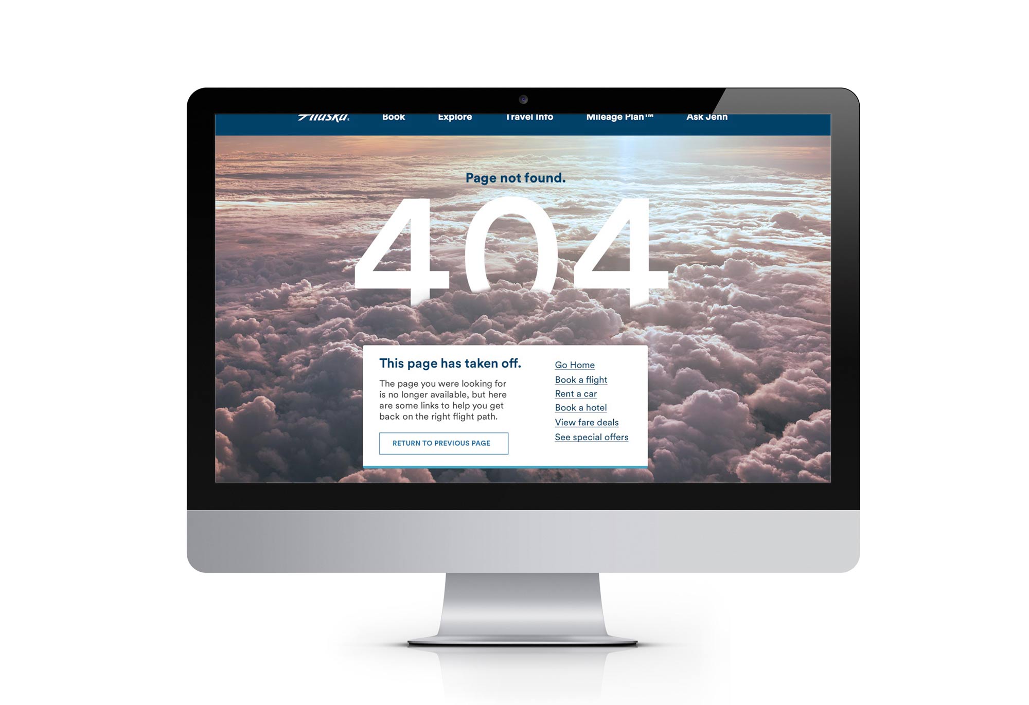
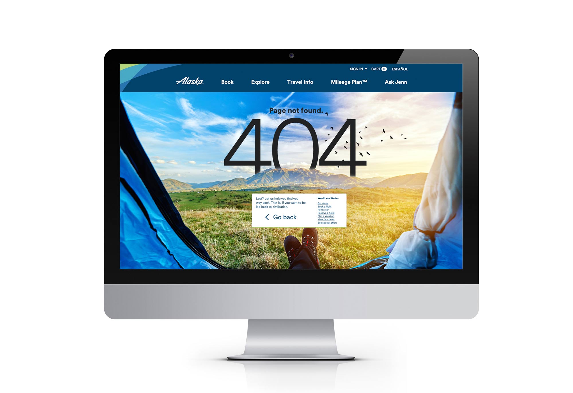
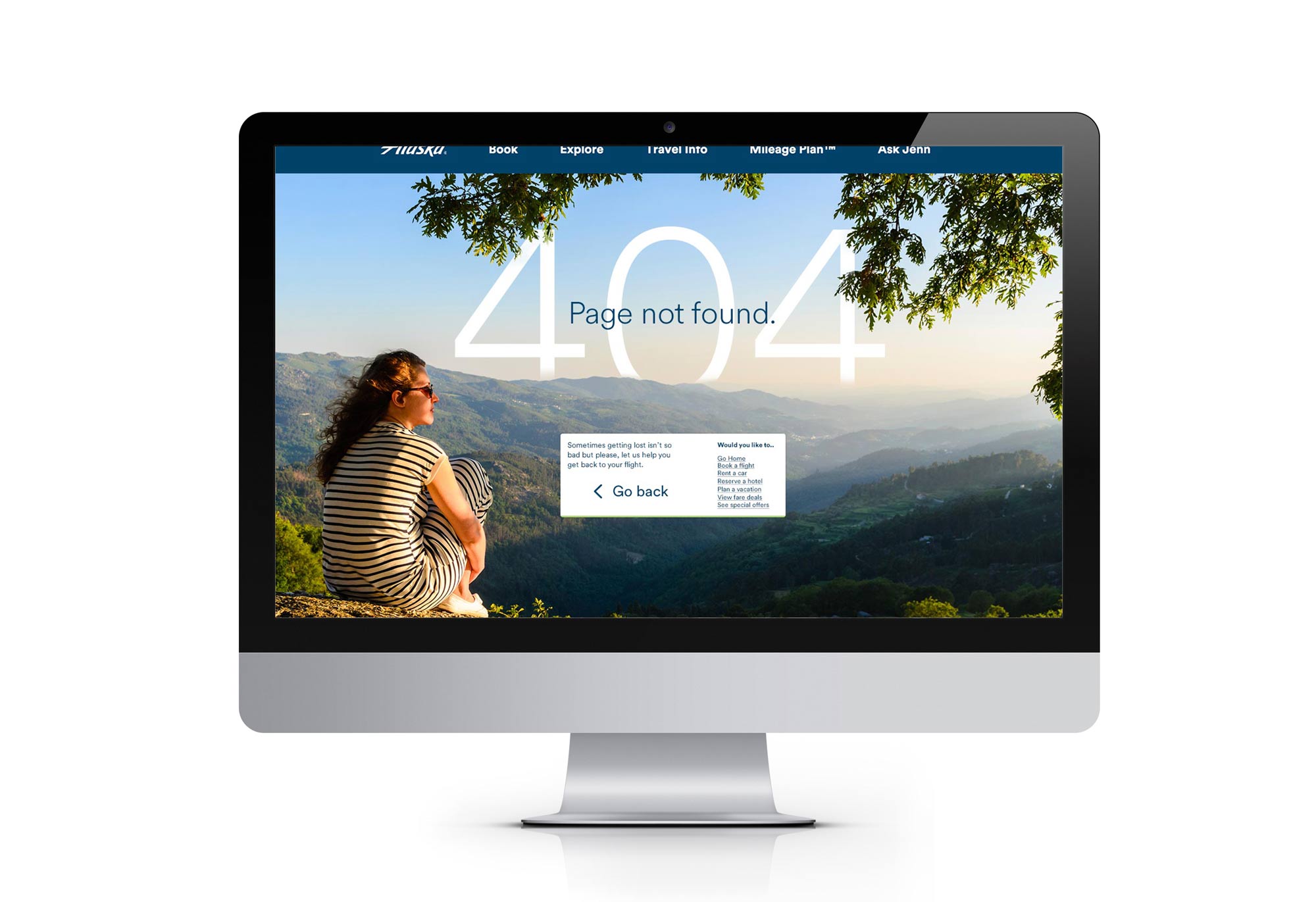
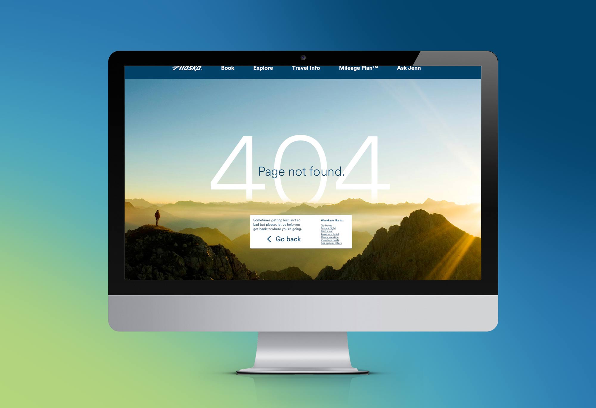
404 Page Redesign
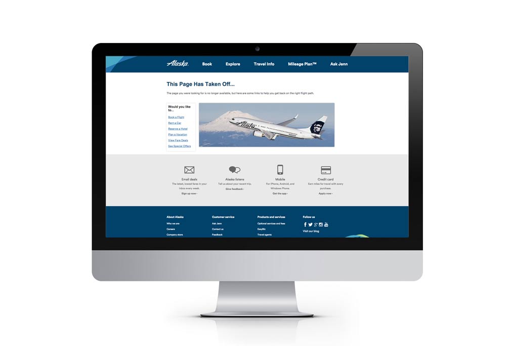
With the opportunity to re-think the 404 page, I wanted to acheive something that helps turn users into brand evangilists. By including something interesting we are able to grab the user's attention and they will see that the page was thought about. This makes Alaska's website seem more personable, which is always good for a user if they are contacting a company for their services. A well designed 404 error page also helps to increase conversion. In the gallery you can see my iterations before arriving on a team-aligned decision where I worked with other designers for feedback and a copy writer for the appropriate on-brand text.
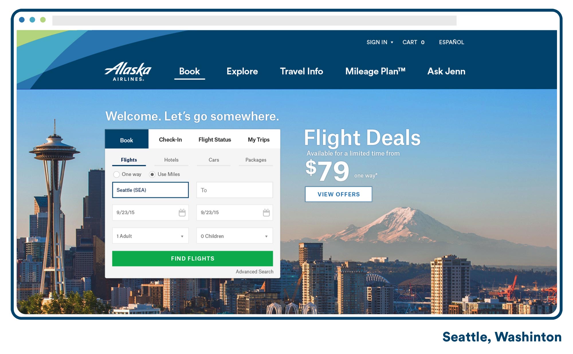
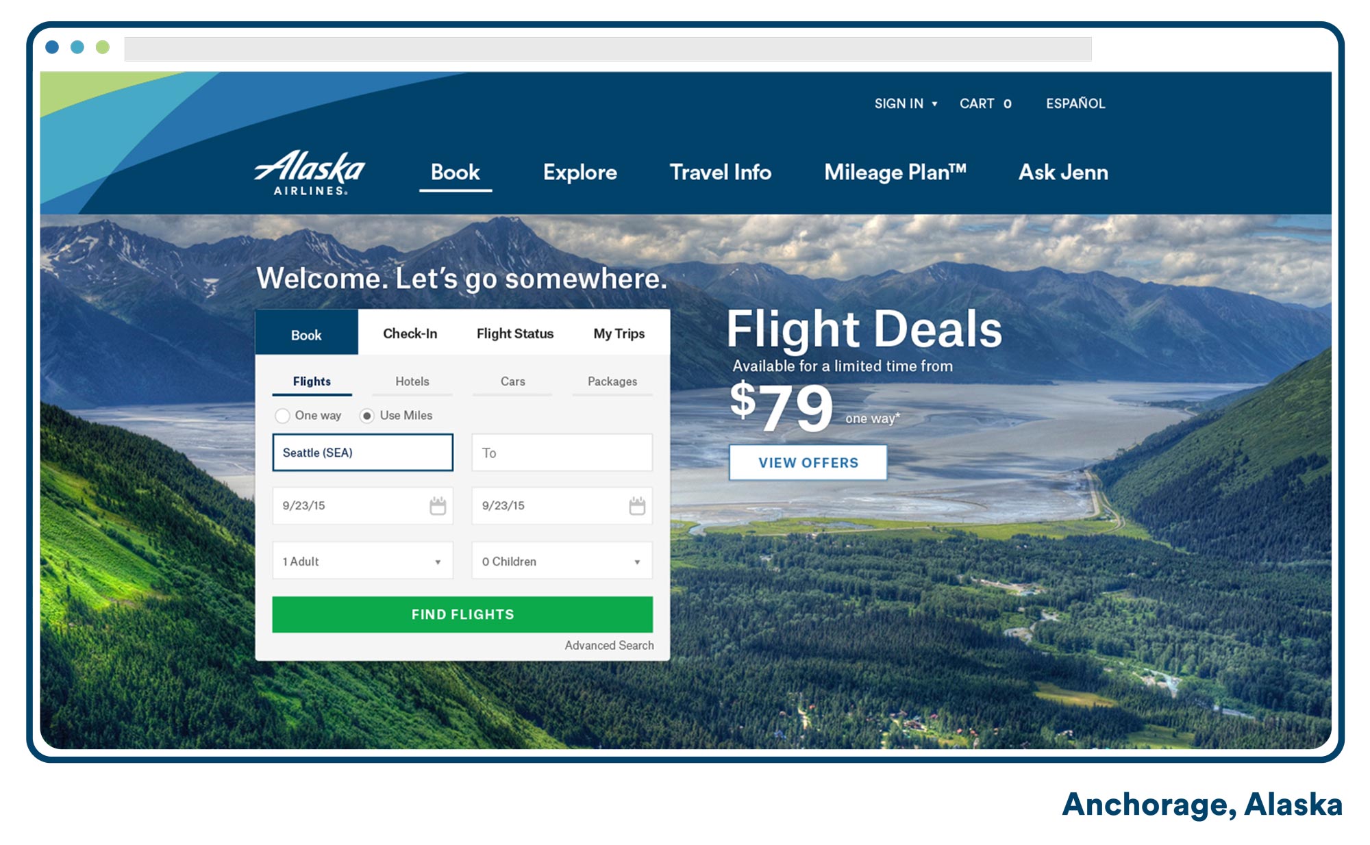
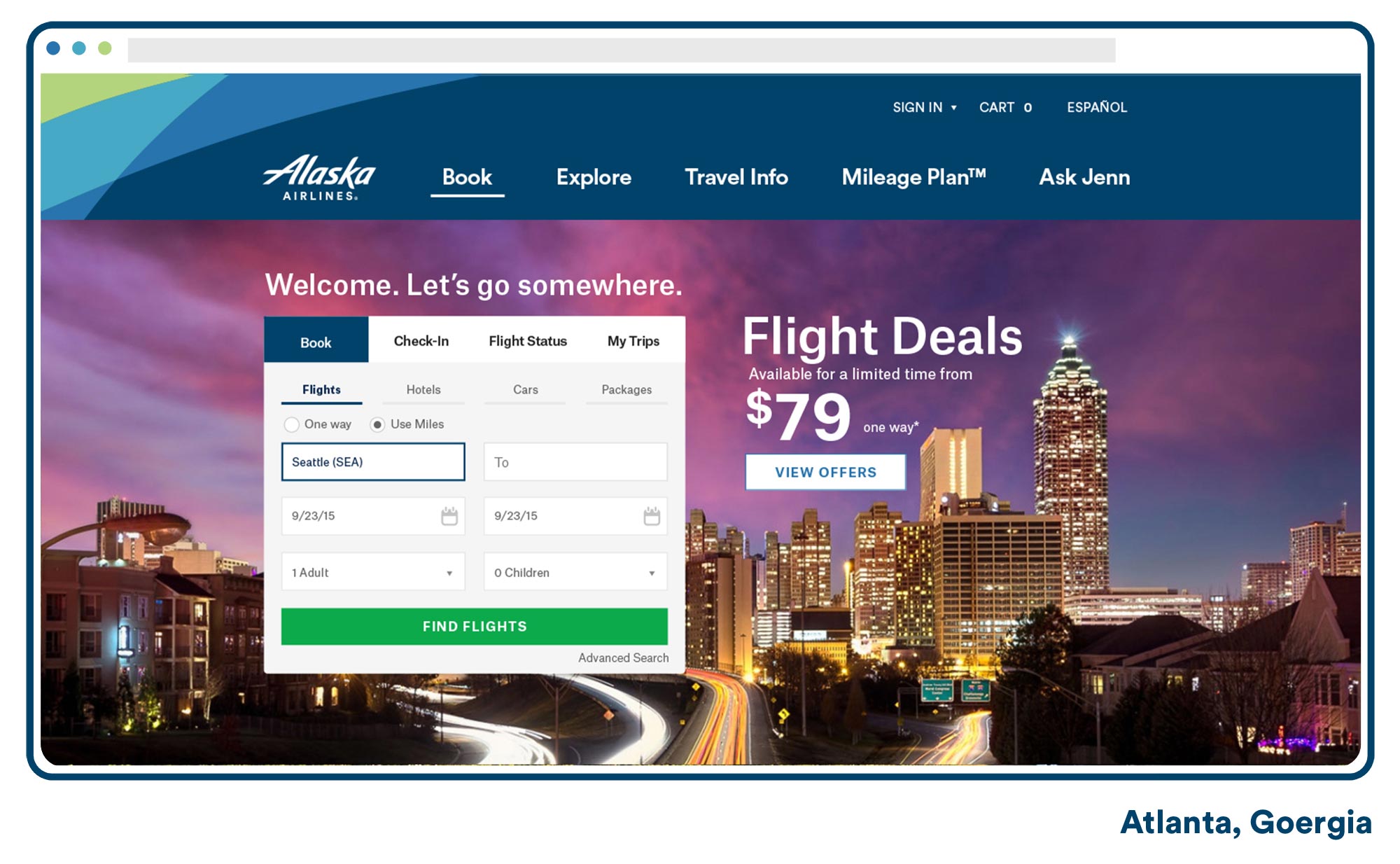
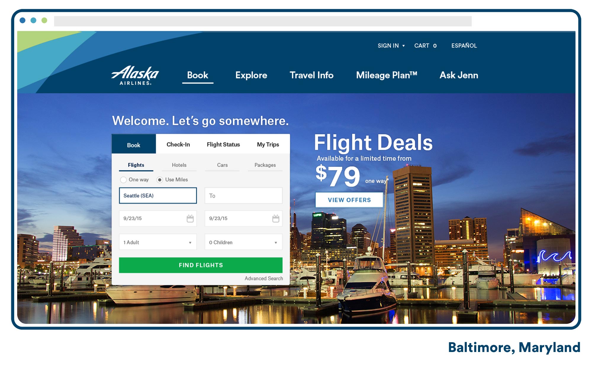
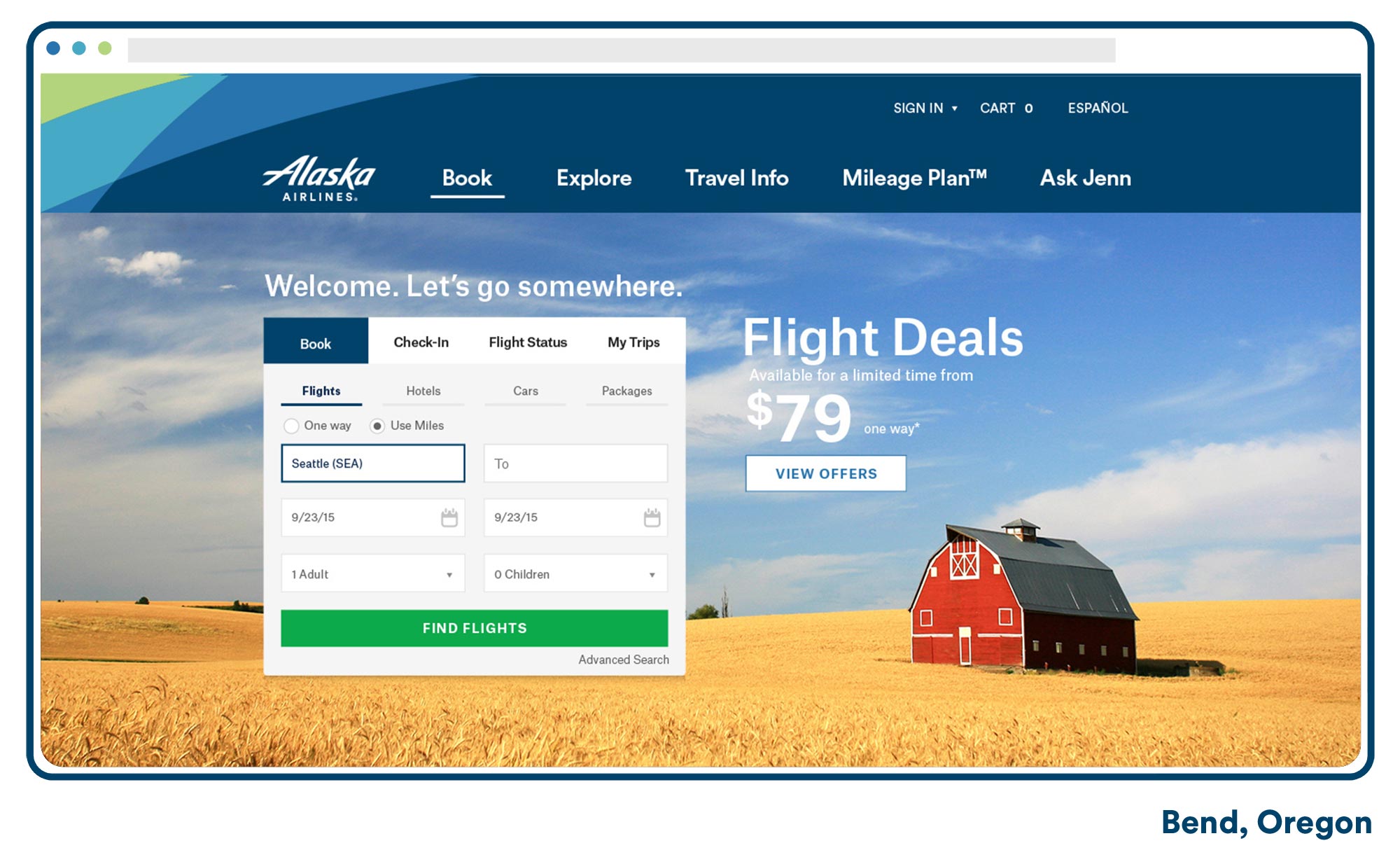
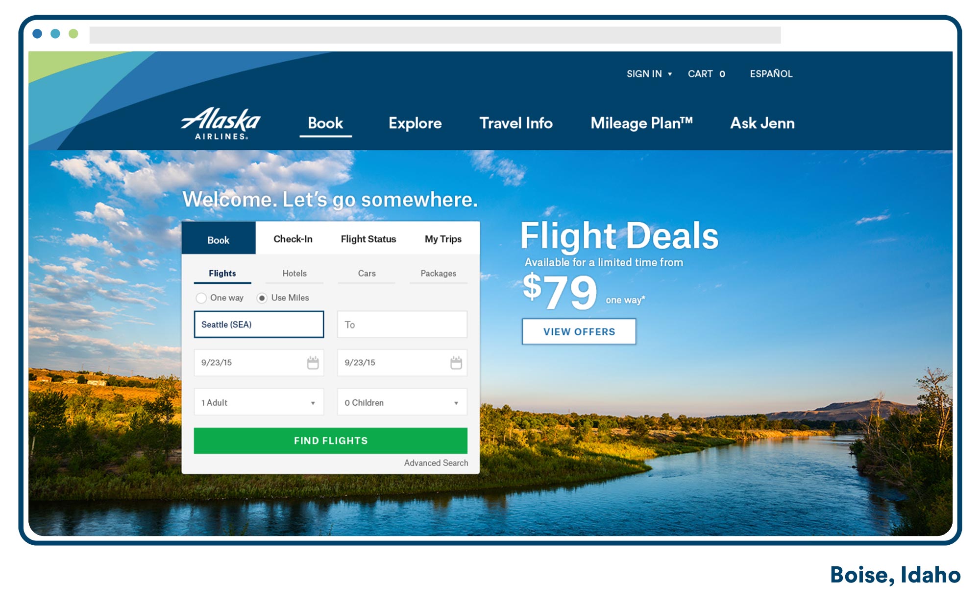
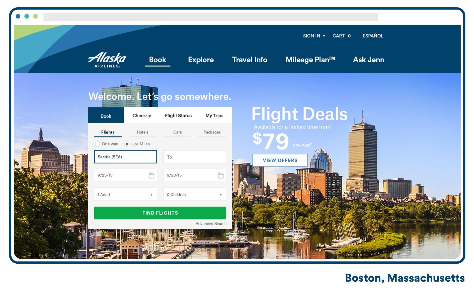
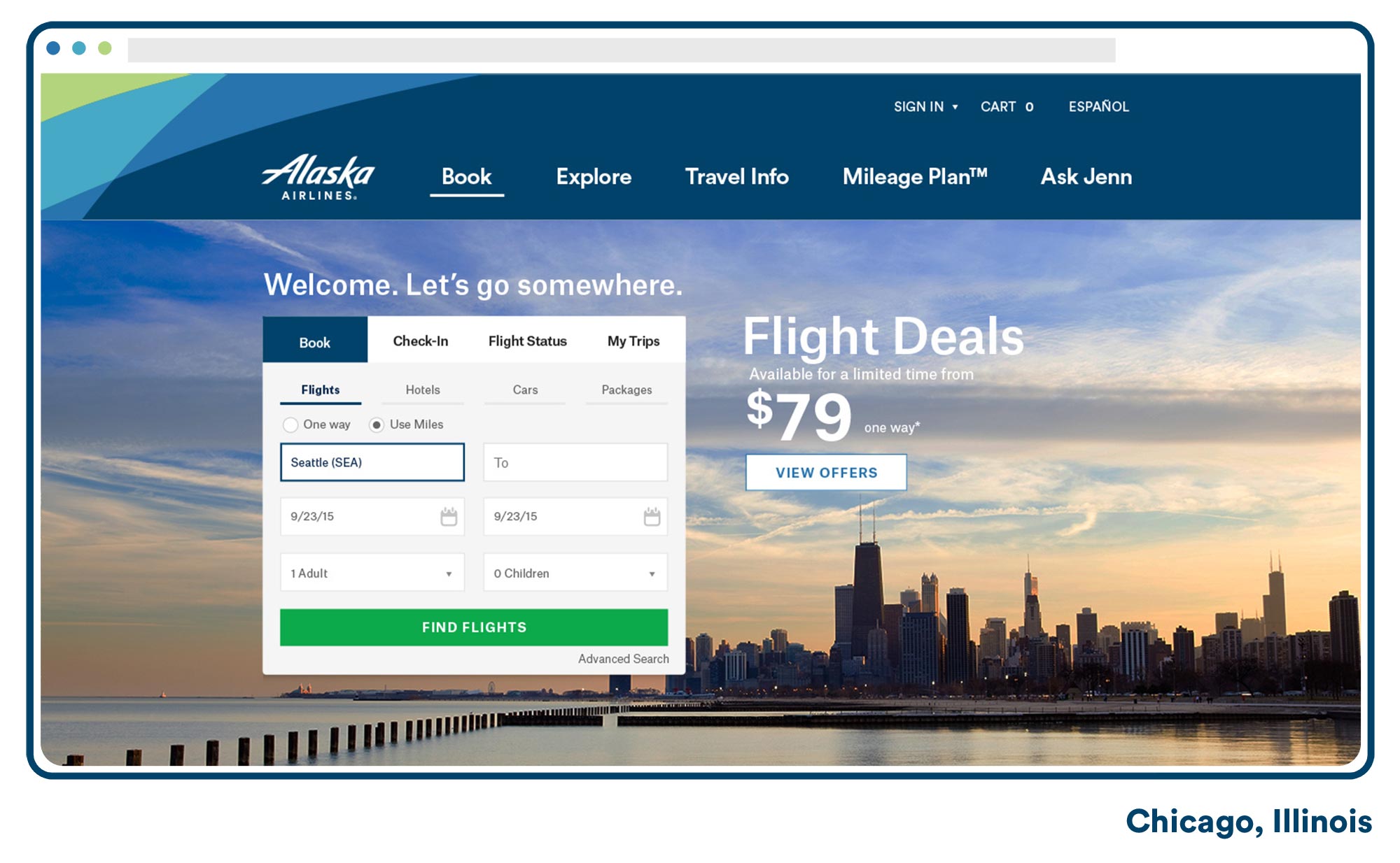
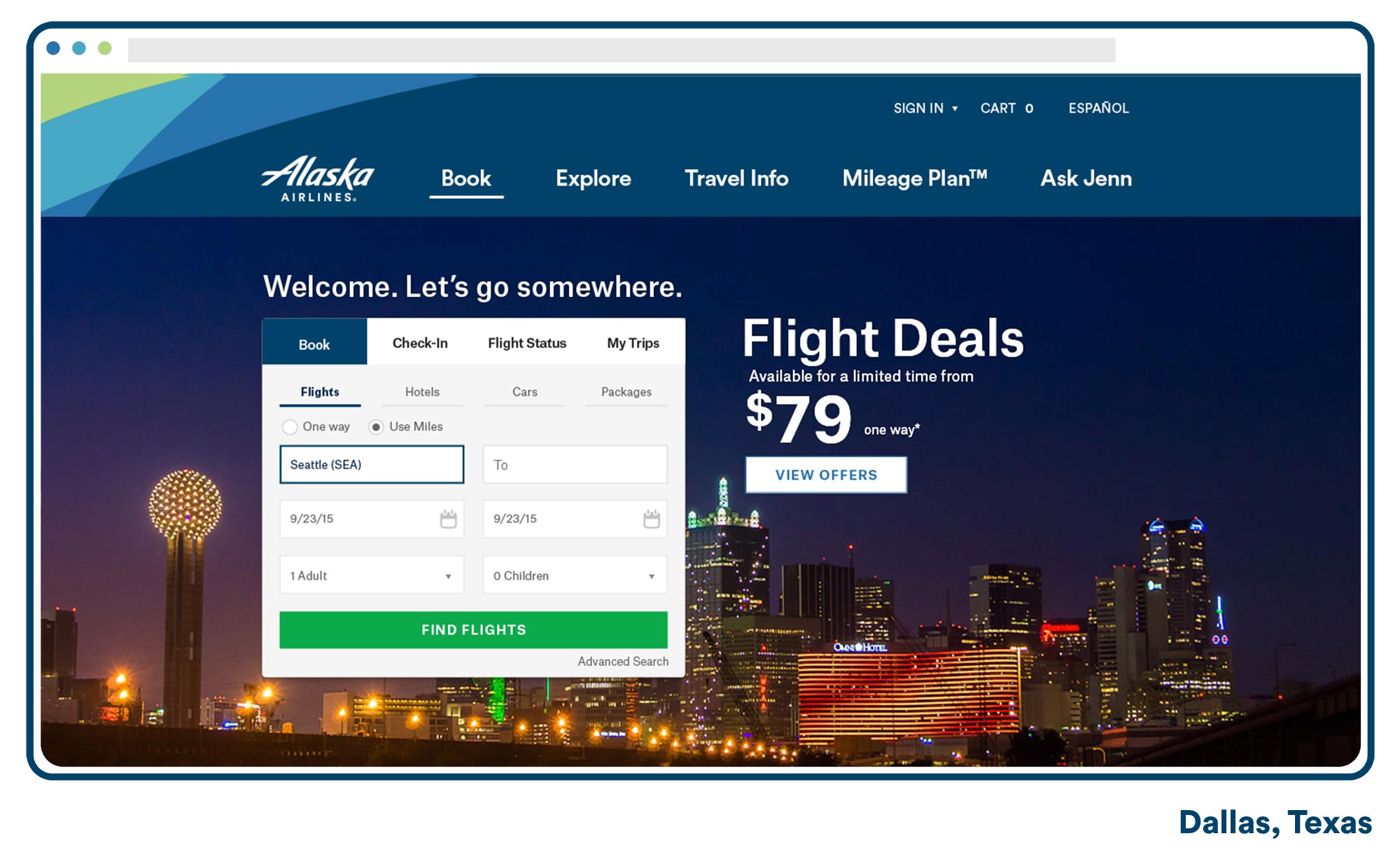
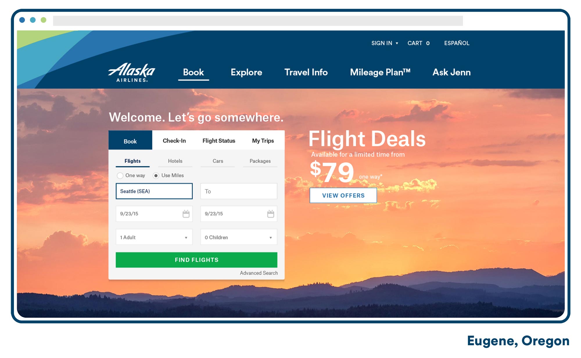
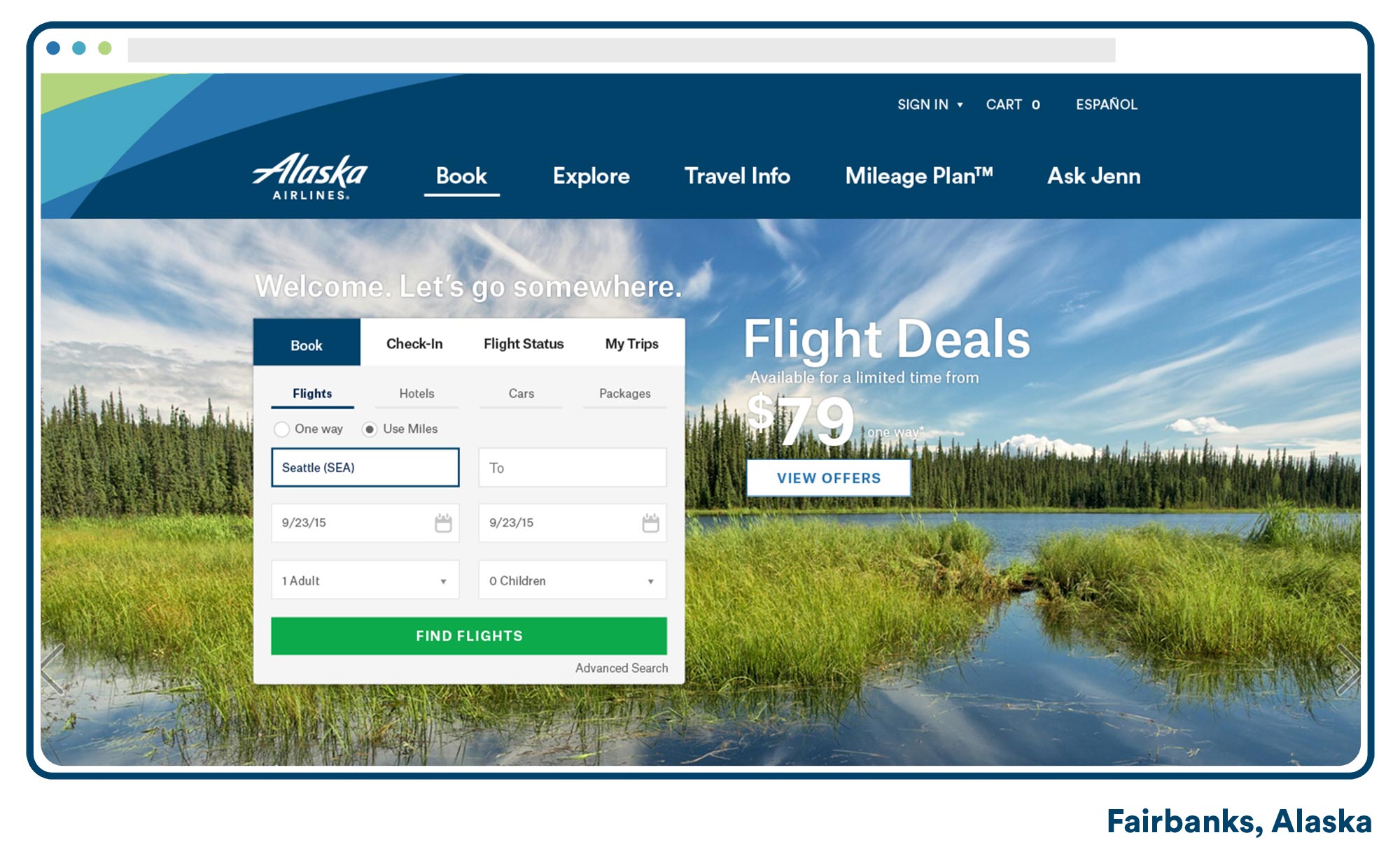
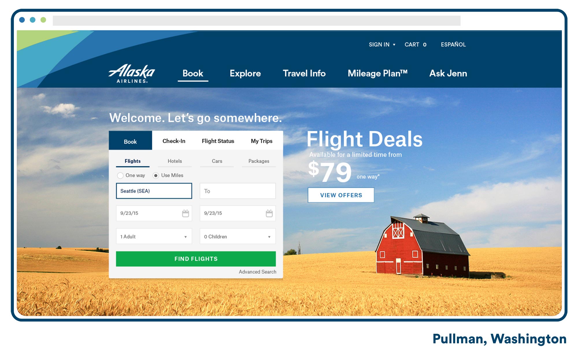
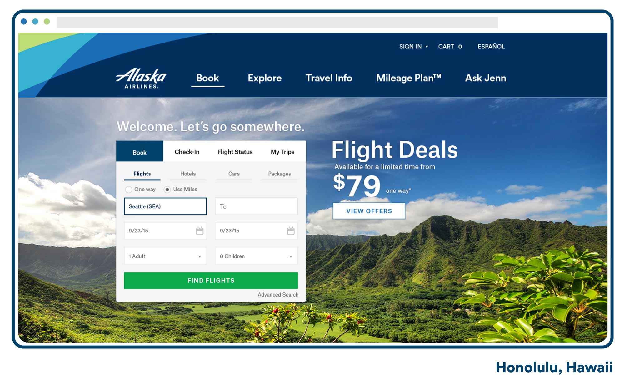
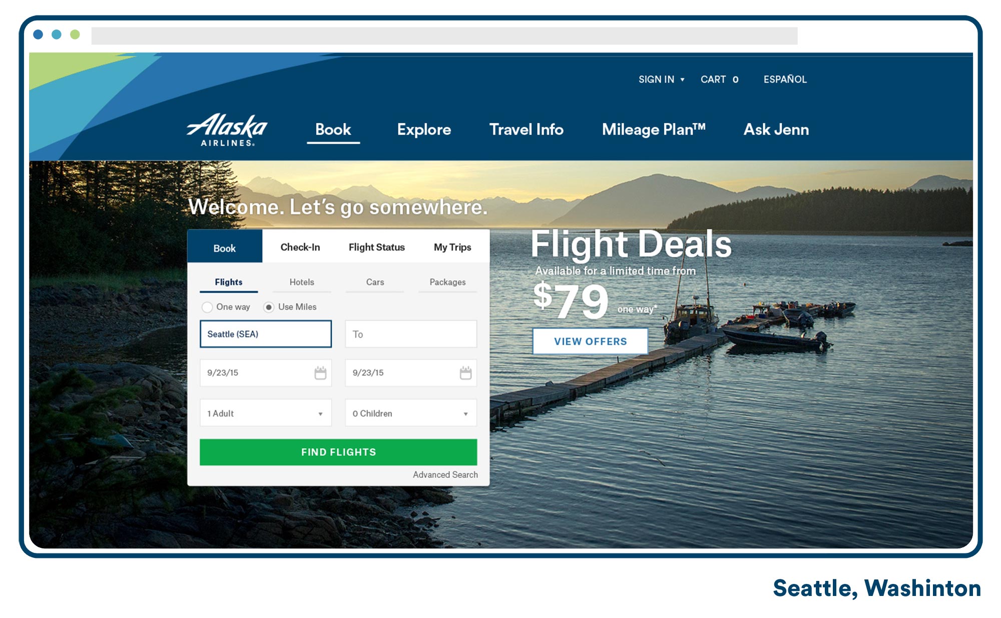
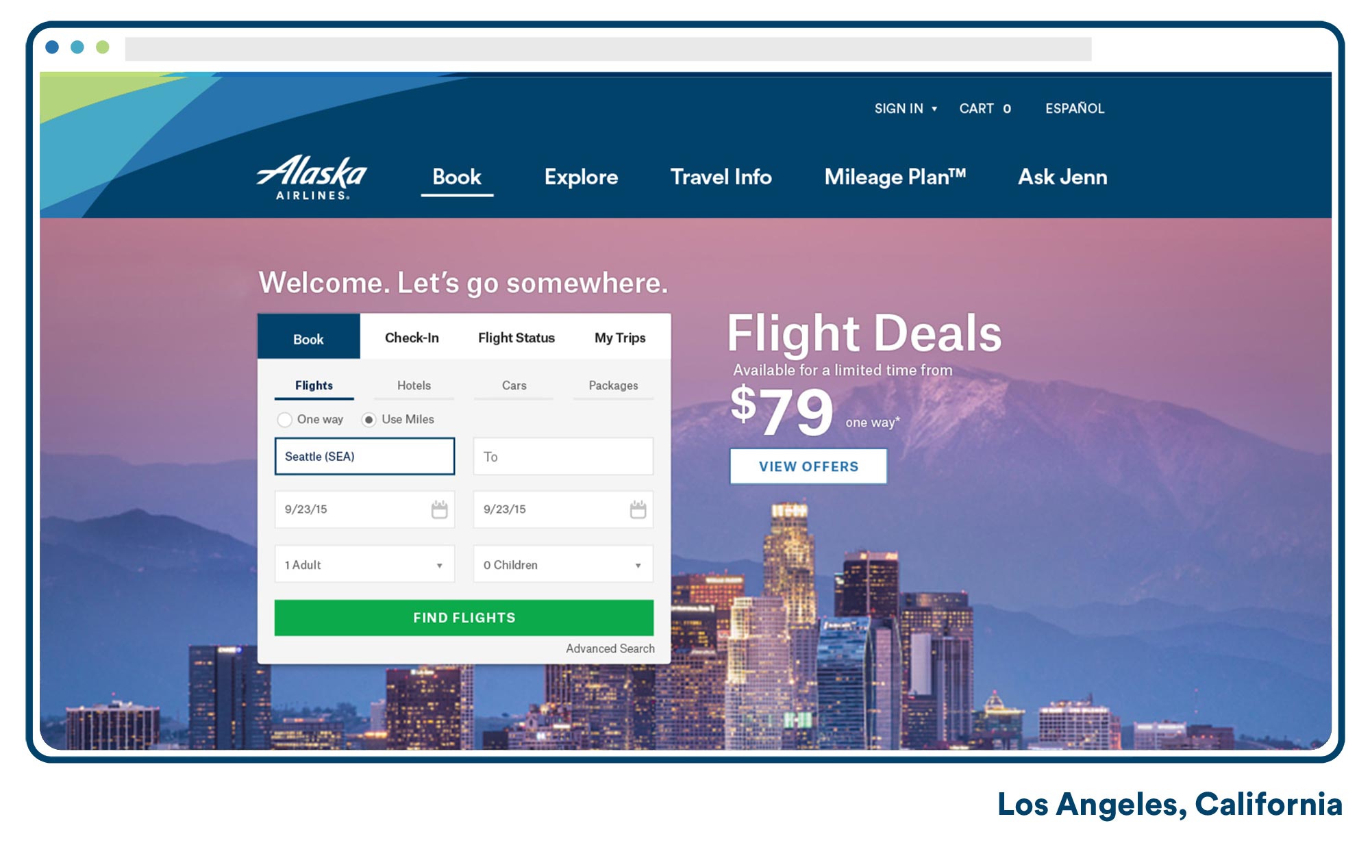
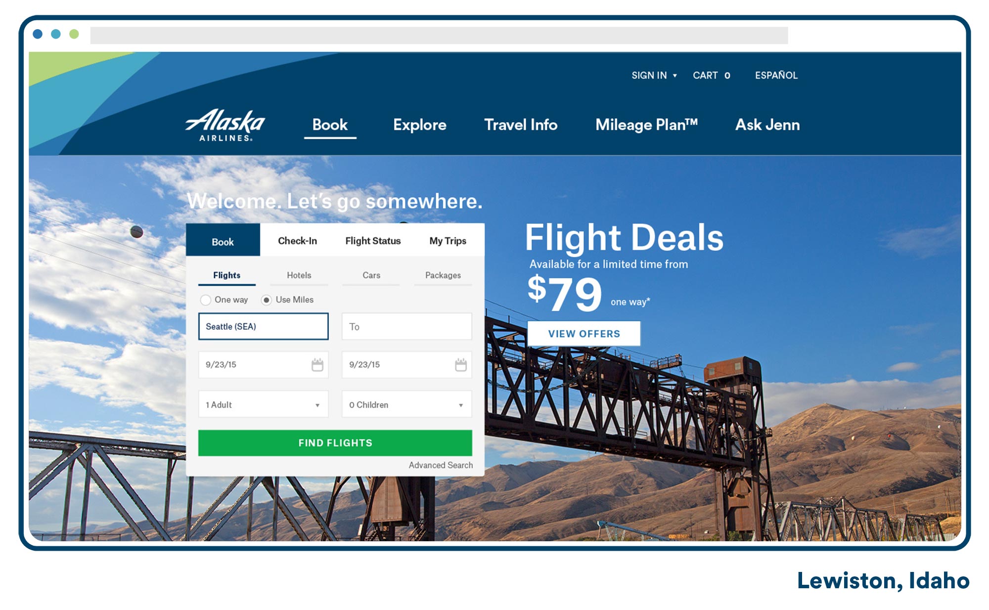
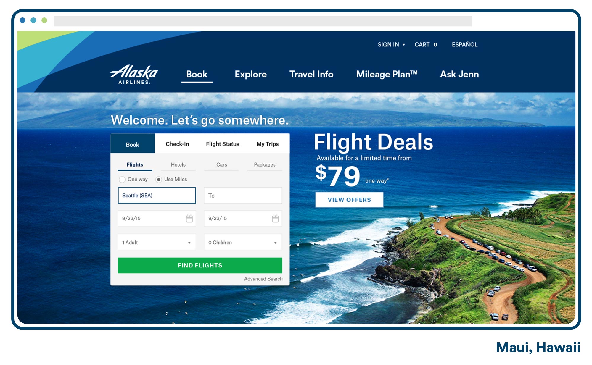
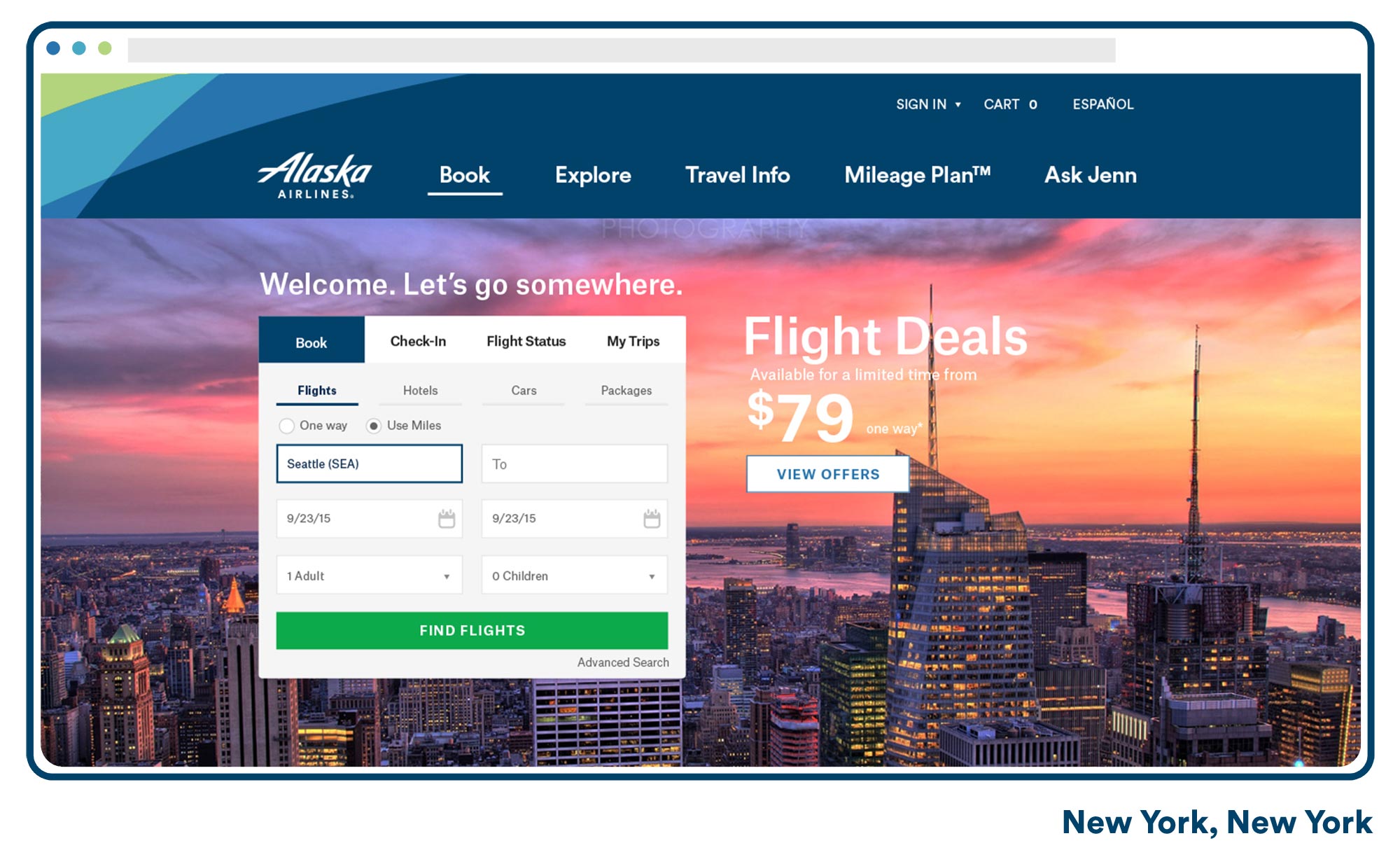
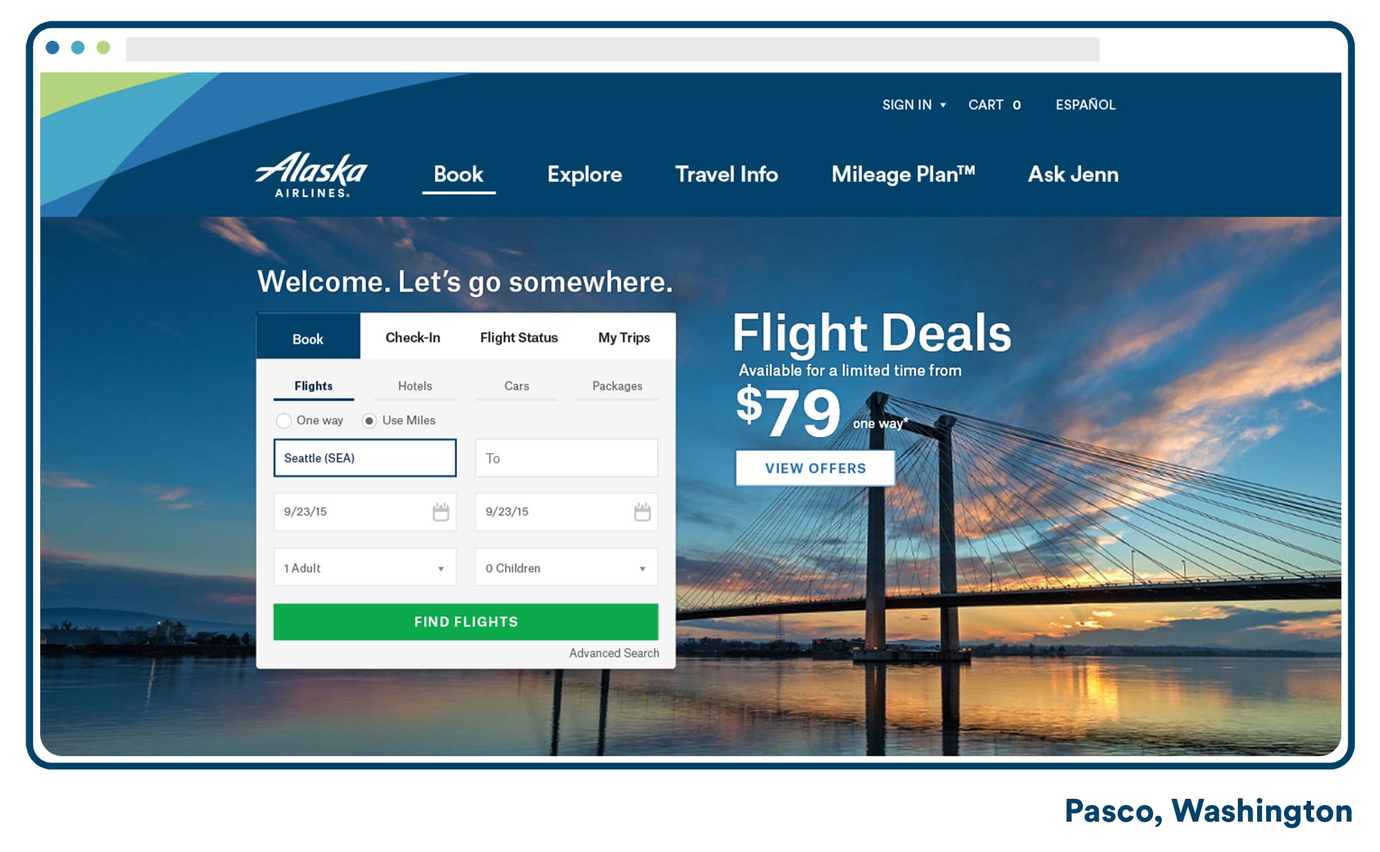
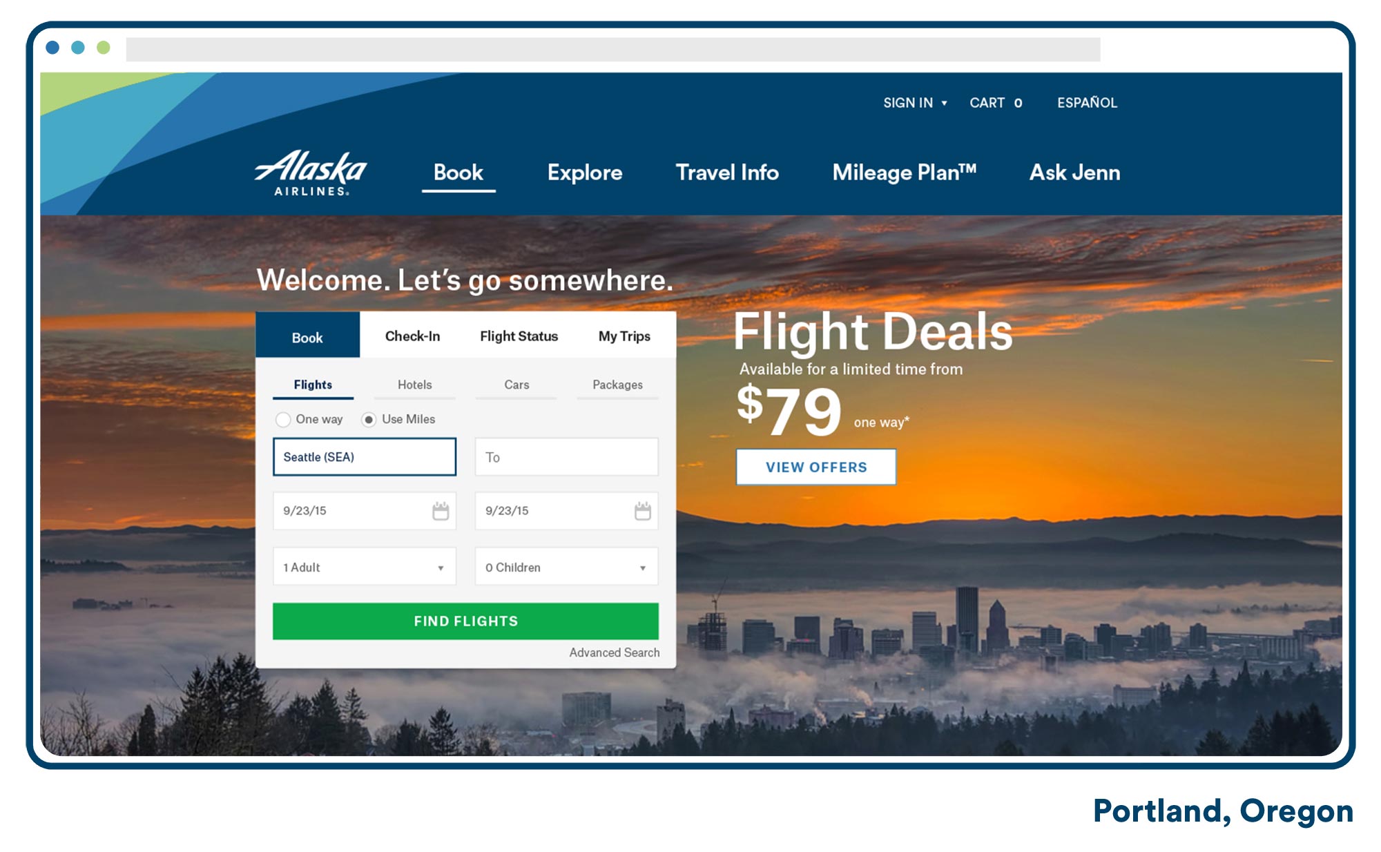
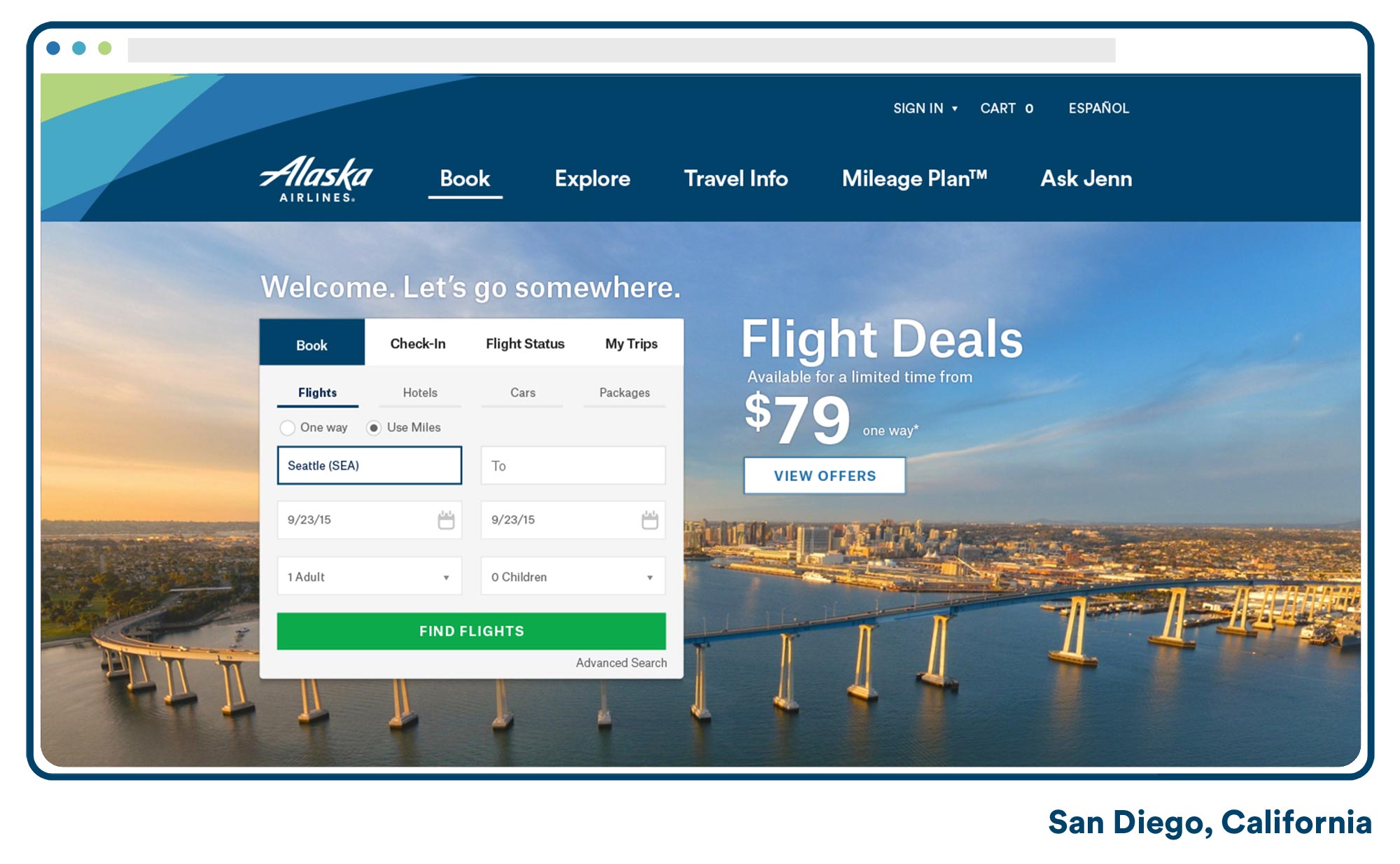
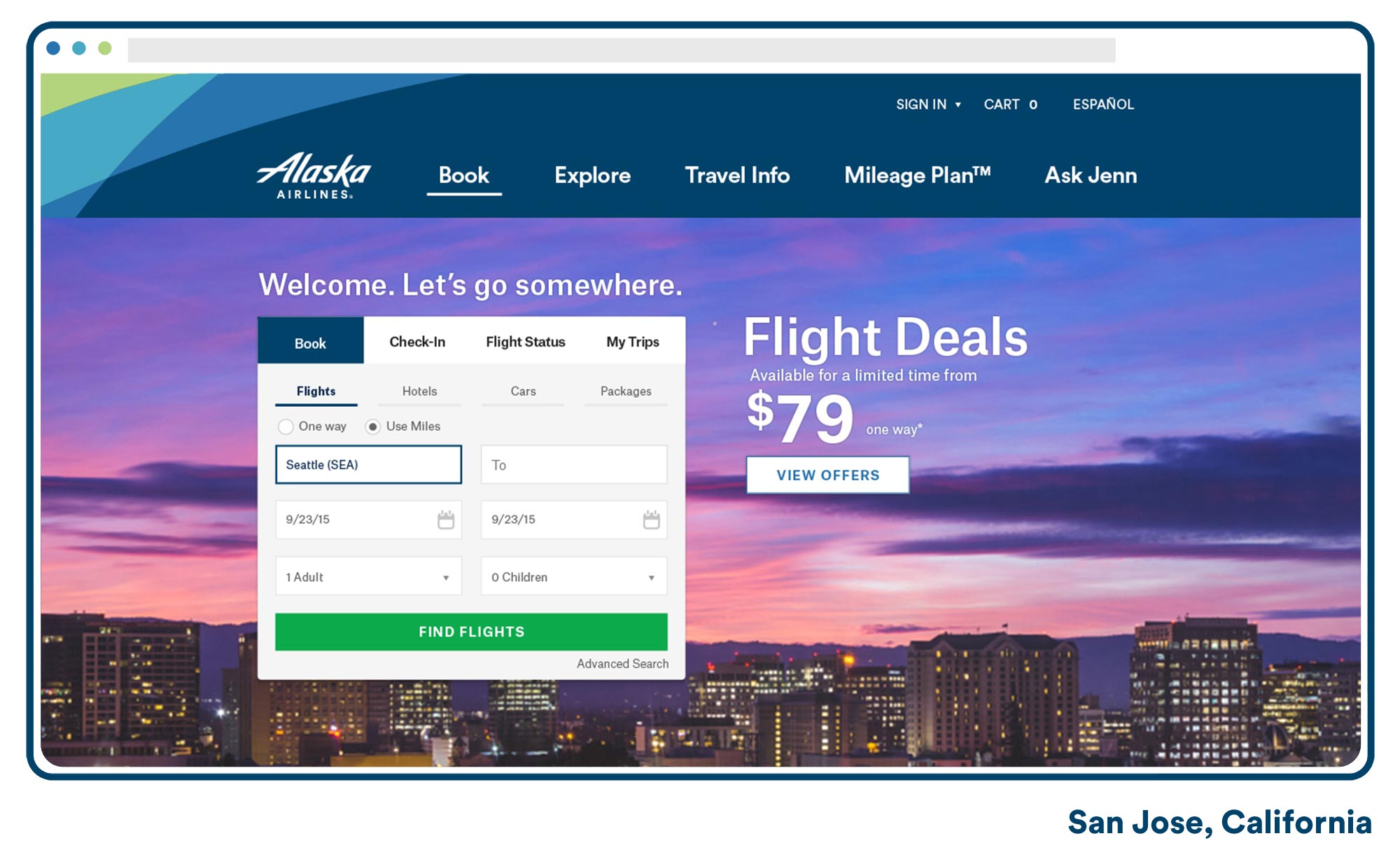
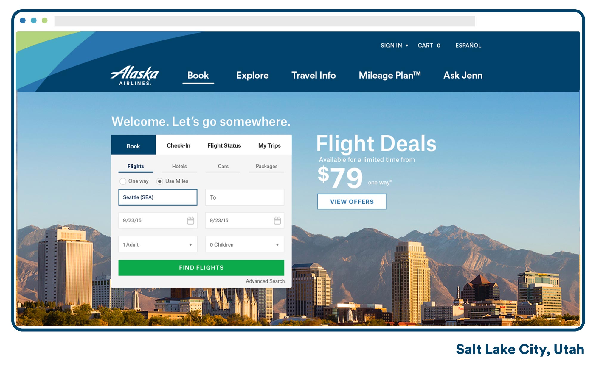
Geo-Targeted Hero Images
Alaska's strategy for customization and personalization comes in many forms. Working with the brand photo guidelines I replaced over twenty hero images for Alaska's key markets from Hawaiin islands to the New York metro. After constant collaboration and persuasion between team members I narrowed each city down to 3 on-brand images. From there, I used Invision and UserTesting.com to get feedback on our selections from actual users in those regions. Hearing users talk about photos of their own city was immensly helpful in getting buy-in from stakeholders and project managers.
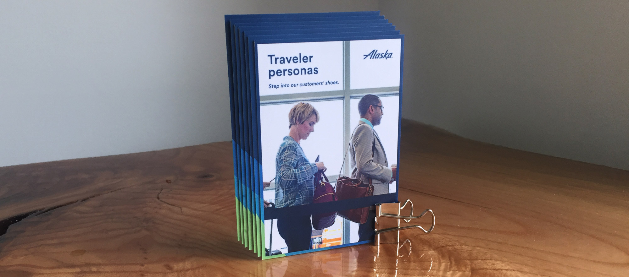
Styled Personas
Great personas can inspire innovation and fuel customer-centricity. Bad ones can mislead and leave you vulnerable. Alaska Air had been collecting data on travelers for years through different methods and outlets. Anaylists generalized the data in 6 sepreate segments and found statistics and unique differences within each segment. When I stepped into the project the problem was simple. How do we present this data with ease and delight? Teams whithin Alaska make decisions with intent and in order to create a more customer-centric atmosphere I decided to make persona baseball cards. UX Designers, developers, project managers, stakeholders and all Alaska employess have access to these cards and an A4 size PDF document with more in-depth persona info.
Alaska Inflight Identity Bump
I had previsouly done a small motion project that displayed over the big screen during Alaska's brand unveiling party so being asked to work on the Inflight Entertainment was a real honor. There are multiple channels within Alaska's inflight entertainment - each has their own animated intro, each slightly different than the other. We decided for the update, it would be best to have 2 animations – One intro and ending for the SIFF Cinema Selects and one intro and ending for the rest of the channels. The challenge with these was coming up with something that was soothing to watch over and over again while still remaining within the brand guidelines.